Note: This case study has been updated on 31 January 2023. The video above does not include all the examples mentioned in the case.
Executive summary
The Visma group is a leading provider of software and services in the private and public sectors. They have a wide presence with over 200 companies worldwide, 14,000 employees, and over 1.2 million customers.
They value local presence and expertise while sharing world-class competence across the organization. One great example of this is the Visma Data Lake that they built to enable Visma companies to bring business value out of their data, making it accessible in a secure and reliable way.
E-conomic - which is part of the Visma group - offers an award-winning web application for online accounting. As a SaaS provider, they are aware of the importance of onboarding as it can make or break an account and its customer lifetime value (CLV). According to a 2020 survey by Wyzowl, over 90% of customers feel companies could do better when it comes to onboarding and 86% say they’d be more likely to stay loyal to a business that invests in onboarding.
For that reason, they were making use of in-app messaging with an onboarding focus on the home tab of their application. However, there was an issue. The average loading time of the in-app message was about 10 seconds, during which most users would have already navigated away from the page without seeing it. And of course, in the day and age of the internet, every (milli)second counts.
They addressed this with the help of UNLESS and its custom drop-in components which brought the load time from 10 seconds to 300 milliseconds or in other words 30x faster. This improvement in performance meant many more users of e-conomic were now seeing the in-app message block.
With Visma Data Lake and Unless joining forces, it was possible to segment their users based on a variety of data points. E-conomic could then provide information and nudges throughout the web application to ensure the ease and success of their customers using both pre-built templates and custom components of Unless. Find out more below.
Execution
In order to display relevant onboarding experiences via Unless components, e-conomic had to first segment its users into audiences. Their customers include small and medium-sized companies as well as accountants and bookkeepers. Different groups with different needs.
How much time passed since someone signed up and which actions they already took are also important indications of what the next step (or recommendation) should be. For this, e-conomic was able to get the data directly from the Visma Data Lake and into Unless and get started quickly.
Visma e-conomic opted for a combination of behavior and in-app data, as well as information from the data lake in order to provide a real-time, hyper-personalized, and account-specific onboarding experience.
Particularly during the onboarding stage where users are new and there may be a fresh out the water feeling, it is very valuable to provide them with help and educational content. Often you have to educate your users on the subject broadly and your product specifically while making sure they take the actions that are crucial to the use of your application. Visma e-conomic implemented a variety of Unless experiences for this purpose including bars, sideboxes, and custom inline components.
One approach was replacing one of the blocks on the homepage of the application with a personalized Unless component that would fit the e-conomic branding and dashboard well. In addition to being aesthetically pleasing, this was especially important in order to match the design guidelines of e-conomic.
Luckily, this was easy to do since all Unless components can be tinkered with to match your company branding whether it be the colors, fonts, or something else. And additionally, components can be custom-built by the Unless team, by your developers, or agency with additional functionality. This way the custom Unless component with relevant content recommendations or CTAs could appear natively within the app.
Let’s take a look at some examples.
Examples of experiences
1. Providing educational content (about accounting/bookkeeping)
Depending on what your application is about, and especially if you are in a B2B context, it is likely that some of your users will need educational content about the subject itself. In the case of e-conomic, this is about accounting and bookkeeping. Below is an example of a custom inline Unless component that is showcasing an Accounting Guide for Beginners that can be downloaded.
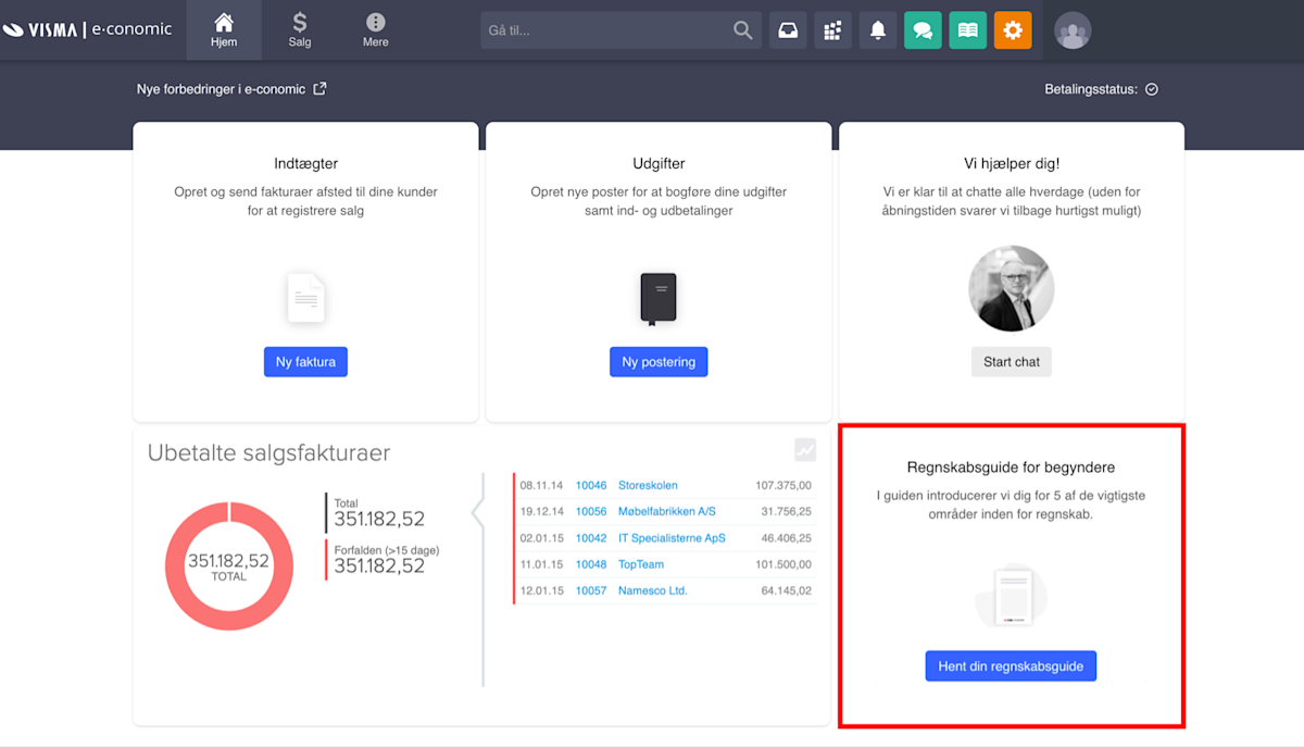
It would be possible to identify these users based on whether they are an individual or working at a company, the size of the company, the amount of experience, seniority, and so on. Optionally, you could use “self-segmentation” to ask them directly whether they would like such content or not, if they are new to bookkeeping, etcetera.
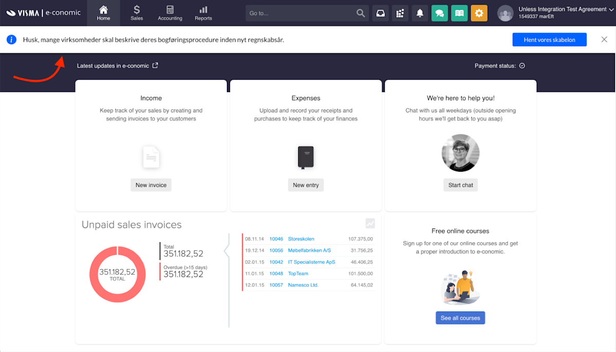
Another example here would be a bar they’ve added to remind their users that “many companies need to describe their accounting procedure before the new financial year”. This is an important time-sensitive message, especially for their customers that are new to accounting. But the help goes further than just a reminder as the button attached to the bar invites the viewer to “download our template” to make things easier. This component alone showed almost 160k times and had a whopping 5% conversion rate resulting in 8k clicks to the template download page.
2. Providing educational content (about e-conomic)
Once you are certain that your users are up to date with information on the subject matter broadly, you can get started with educational content about your product specifically and all the ways in which it can be utilized. After all, at the heart of a product onboarding lies… your product!
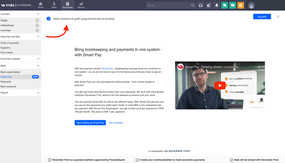
Starting with some examples that are ready out of the box, there is the bar component they’ve used to show their users how to get started with their first payment with a link to a guide they can check out.
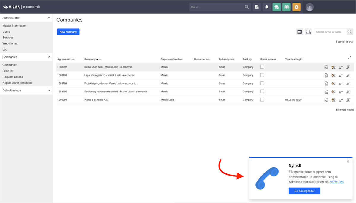
They’ve also made use of a side-box component to inform their administrator users that it is now possible to get specialized support as an administrator in e-conomic by calling a certain number. The CTA in this example links to the working hours of the customer support team.
Next up, below you will find a selection of screenshots where e-conomic has communicated to its users that they have a mobile application, an e-copedia, a getting started guide, and more. They have also used this space with an Unless component to provide tips to their users about different functionality that is available in their app, like an overview of your VAT calculation.
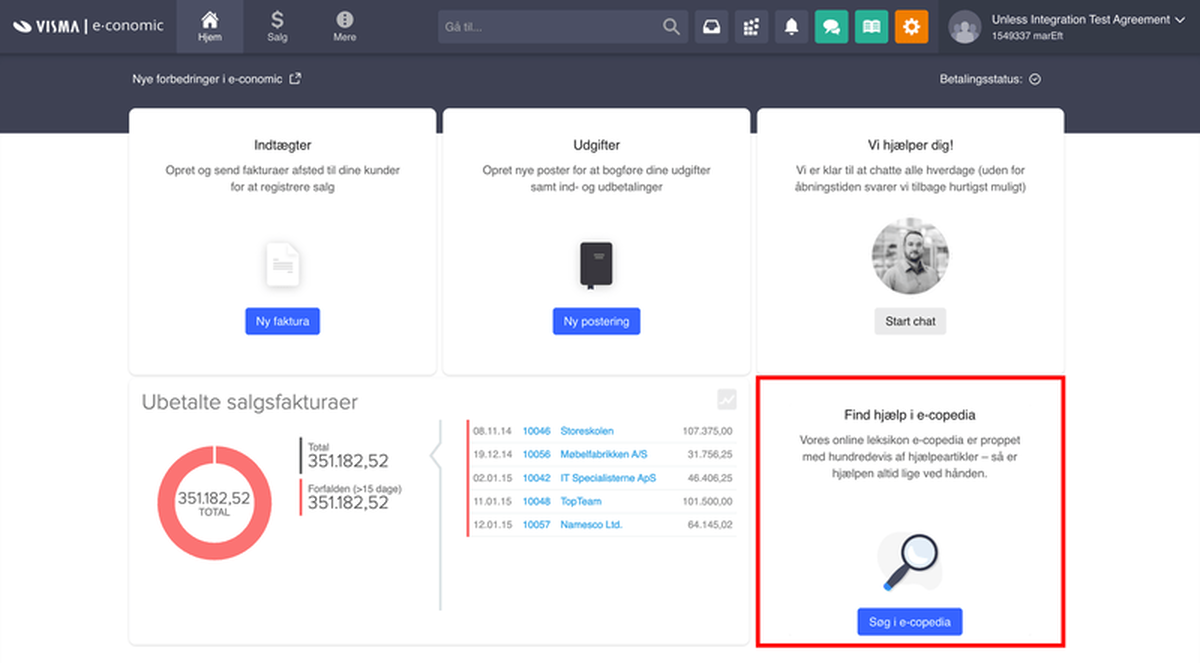
With all the content recommendations and guidance they were providing, of course, it was also important to test those messages and see which ones are working better. And when you have as many contacts as e-conomic does, it can be easy to get statistically significant results very rapidly.
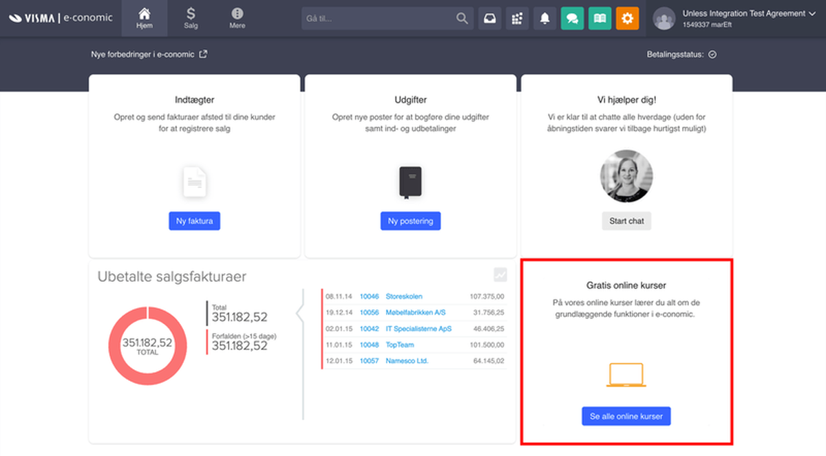
Above is an example of two variations they came up with in order to promote either their free self-help universe called “e-copedia” or their online courses. Using these two variations they gained insights into which one of the offerings is most relevant to their trial customers. The CTA has remained the same however they have slightly adjusted the headline and subhead, while also using a different visual.
3. Providing account related guidance
Now that we looked at users knowing about the subject matter more broadly and the product more specifically, there are also some practicalities to keep in mind. With any application, there will often be some steps that you as a user need to take whether it be to confirm your email address, add your colleagues, fill in your account information, select a payment method, and so on.
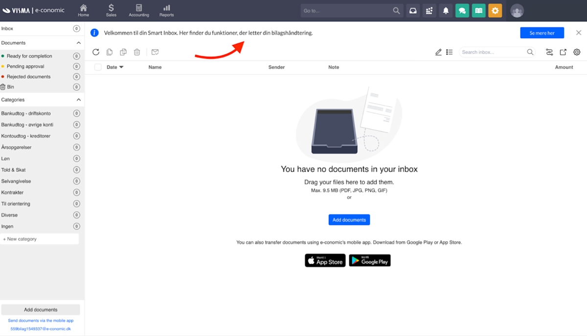
Popovers can be helpful to point out specific things in a dashboard. But one could also make use of bars, sideboxes, or an inline component. Let’s start by taking a look at a bar e-conomic has used to welcome users to their Smart inbox. Providing context that here users will find functions that facilitate their attachment management with a button to see more on the subject.
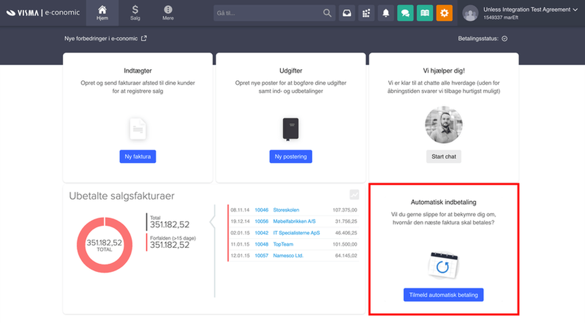
In the below example, e-conomic has used two variations about setting up automatic payments. This time the visual remained the same, the CTA was slightly adjusted and the headline and subhead were changed noticeably.
Key takeaways
- Onboarding is really important - you’ve seen the numbers. And it’s not just about today, but tomorrow, and the day after, and so on. Well-onboarded, happy customers could mean a higher CLV, increased upsell potential, as well as an ally (and your best salespeople), both internally and externally.
- Your data is only valuable if it’s accessible and actionable. In the case of e-conomic, this meant simply connecting the Visma Data Lake to Unless and not having to worry about which data is where, how to get it, and how to ensure it’s clean, correct, and up-to-date.
- Using templates is a quick and easy way to get started but… Your changes don’t have to be limited to elements that already exist on a page nor to components that are ready out-of-the-box. You can get creative with your ideas and at Unless we are happy to assist in making them a reality.
About Unless
Our mission is to help digital teams launch better customer experiences faster. Uniting your customer data sources, the no-code digital experience platform of UNLESS allows teams to rapidly create, deploy, and validate personalized 1-on-1 experiences across channels and devices. As a drop-in SaaS service, it can be added to a website or web application with a single javascript snippet.
Having read the e-conomic use case, components might be of particular interest. Unless feature components are blocks of functionality that you can inject into any website, regardless of its technology, and without touching the website’s original code - by just pointing and clicking. They can contain simple content and pictures, or do complex things with data from external systems.


